about
Marcos
14-07-2022
GRAMMAR OF GRAPHICS -> DATA-> MAPPING -> GEOMETRY
1 Pontos
1.1 Normal
iris %>% ggplot(aes(x=Petal.Length, y=Petal.Width))+
  geom_point()+
  geom_smooth()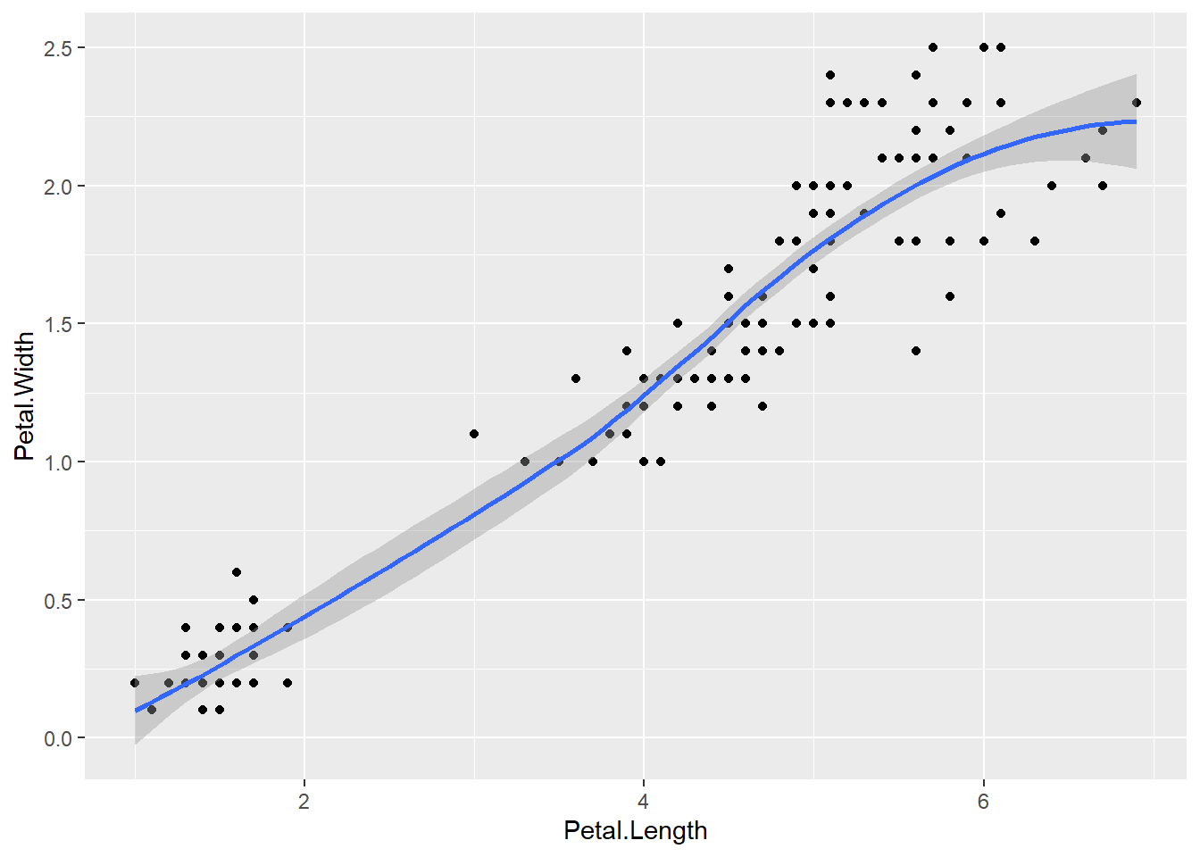
1.2 Linear
iris %>% ggplot(aes(x=Petal.Length, y=Sepal.Width))+
  geom_point()+
  geom_smooth(method = "lm", se = FALSE)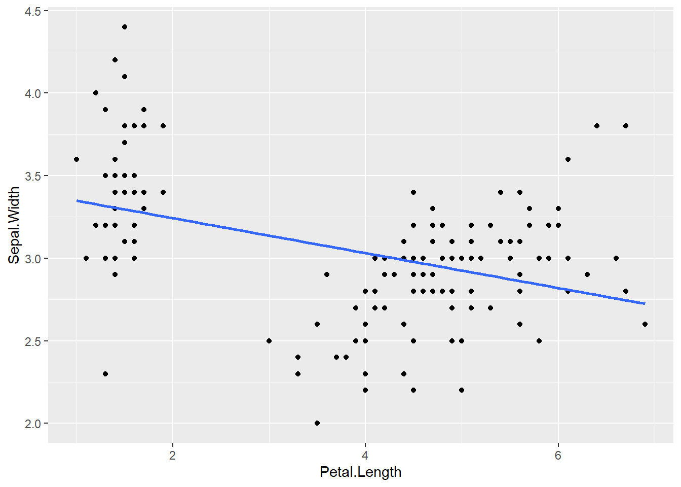
1.3 Linhas médias múltiplas variáveis
starwars %>%
  filter(height>60 & mass<500) %>%
  ggplot(aes(height,mass, color = sex))+ #color = cor da linha #fill cor do preenchimento
  geom_point(size = 4, alpha=0.7)+
  geom_smooth(method = lm, se = F) +#lm -> line method #SE: AQUELA BORDA CINZA
  theme_light()+
  labs(title = "Scatter Graph",x="Height of Characters")+
  theme(plot.title = element_text(hjust = 0.5)) #titulo no centro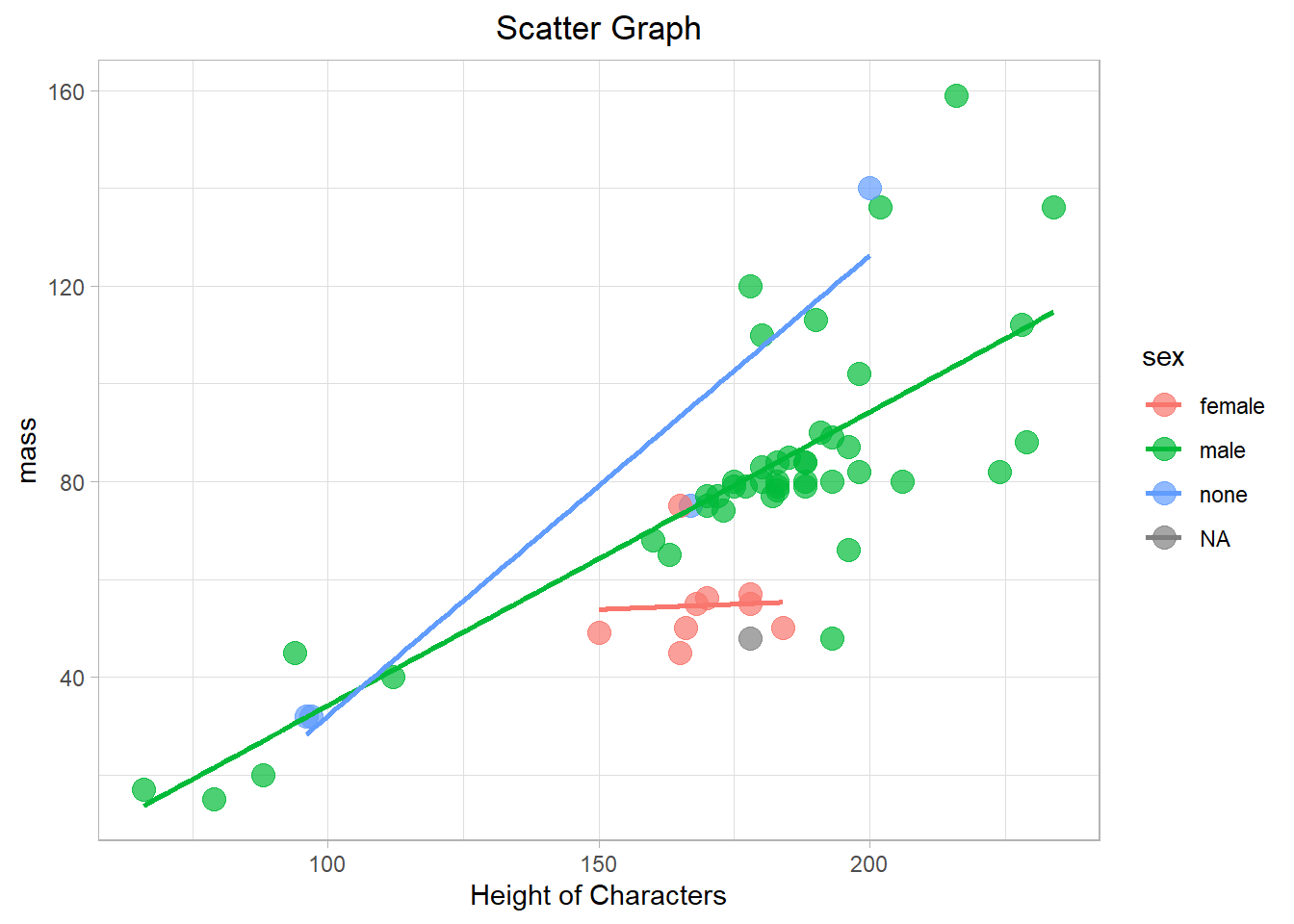
1.4 Com pontos no mesmo lugar
df <- data.frame(x=c(1,2,3,3,3,2,1,1,1),y=c(5,8,4,5,4,5,6,6,6))
df %>%
  ggplot(aes(x,y))+
  geom_count()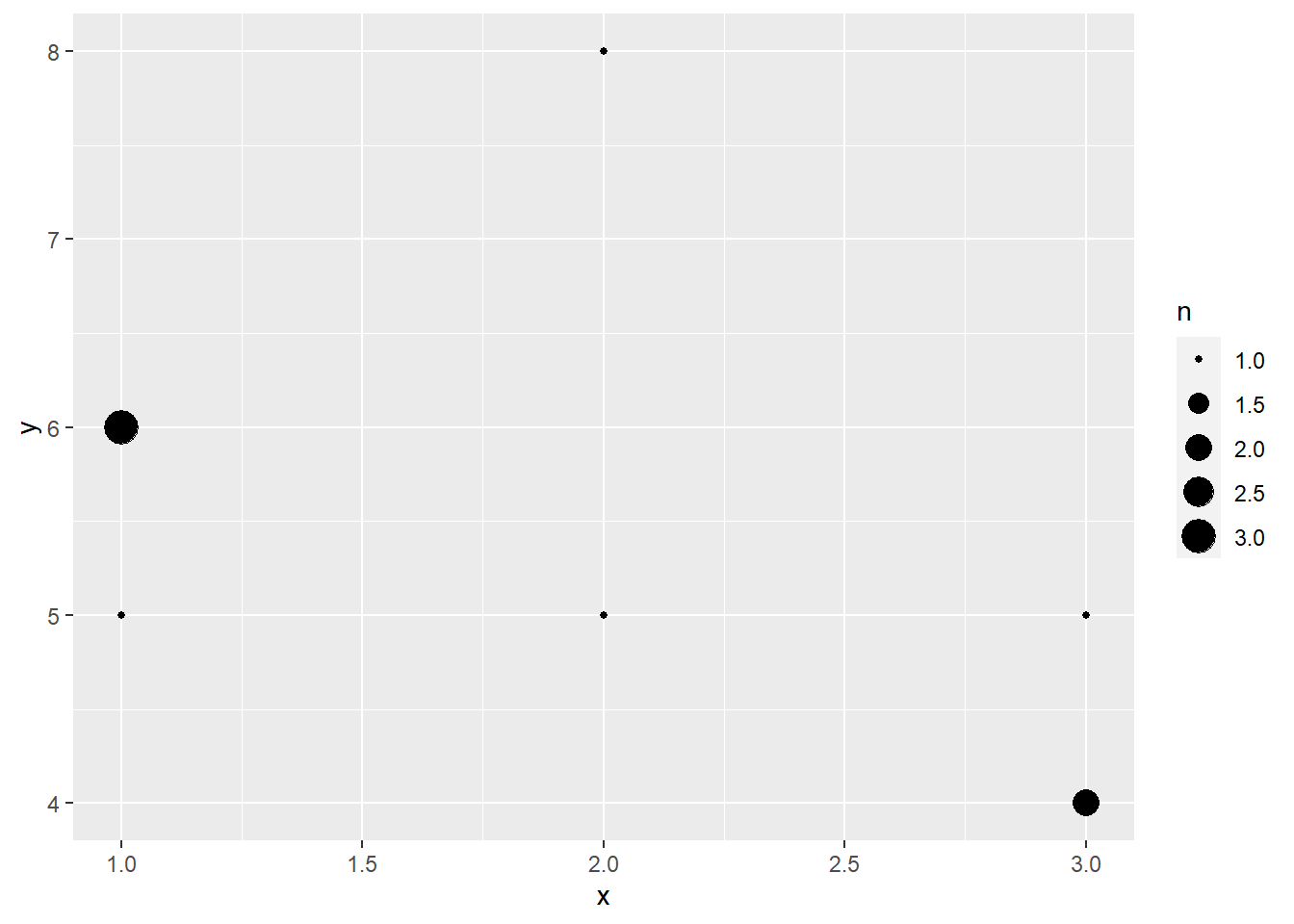
1.5 Outro
starwars %>%
  filter(height>60 & mass<500) %>%
  ggplot(aes(height,mass, color = sex))+ #color = cor da linha #fill cor do preenchimento
  geom_point(size = 4, alpha=0.7)+
  theme_light()+
  labs(title = "Boxplot of Height",x="Height of Characters")+
  theme(plot.title = element_text(hjust = 0.5)) #titulo no centro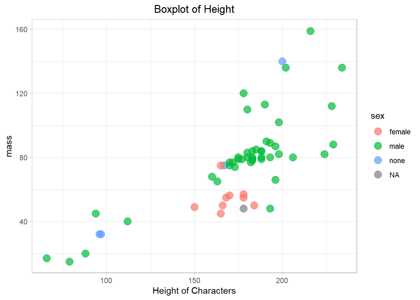
1.6 Smoothed Models
starwars %>%
  filter(mass<200) %>%
  ggplot(aes(height,mass, color = sex))+ #color = cor da linha #fill cor do preenchimento
  geom_point(size = 4, alpha=0.7)+
  geom_smooth()+
  facet_wrap(~sex)+ #Faz um plot pra cada categoria de sexo que existe
  theme_light()+
  labs(title = "Boxplot of Height",x="Height of Characters")+
  theme(plot.title = element_text(hjust = 0.5)) #titulo no centro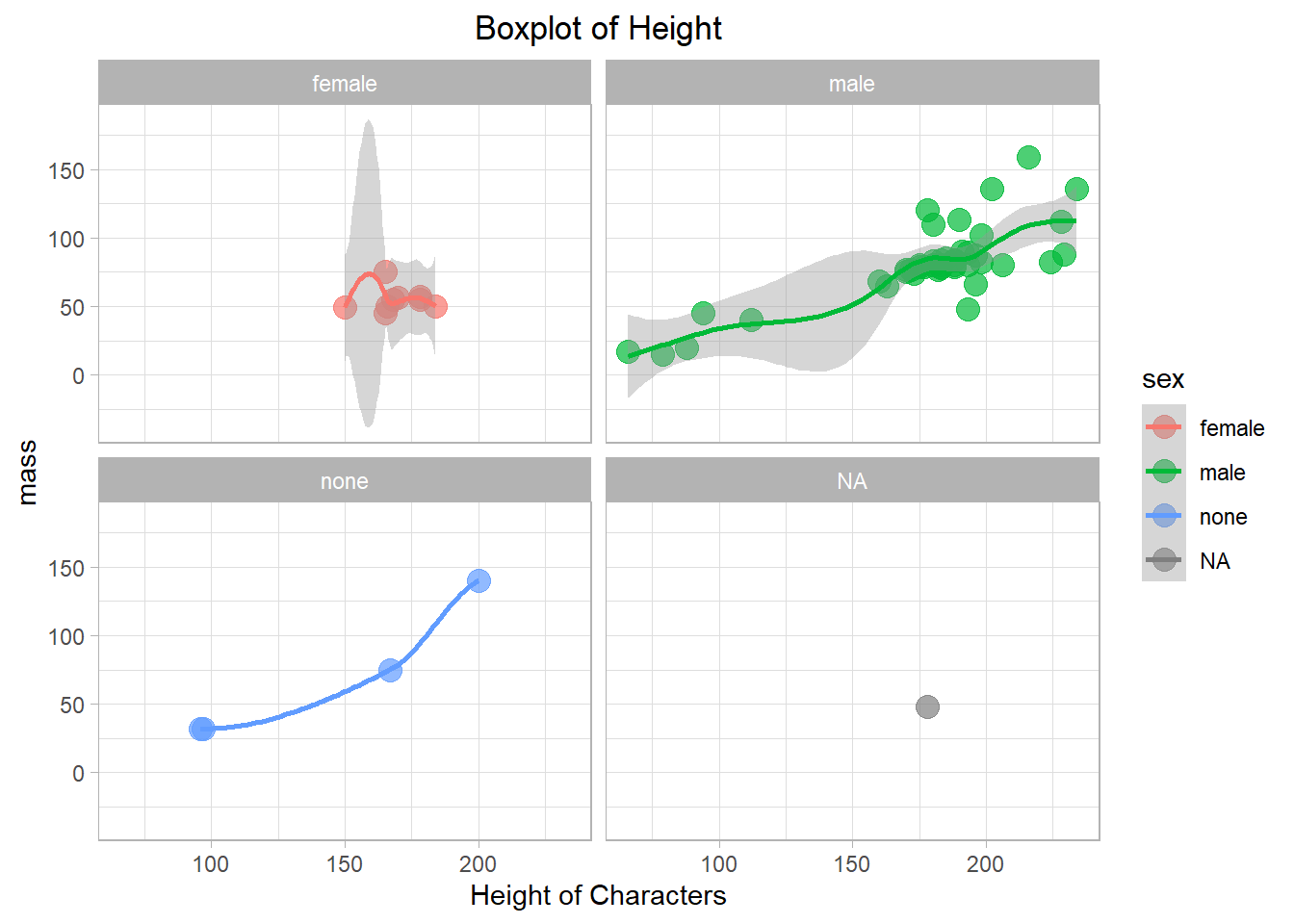
2 Boxplot
2.1 Simples
ggplot(iris,aes(Species,Sepal.Length)) +
  geom_boxplot()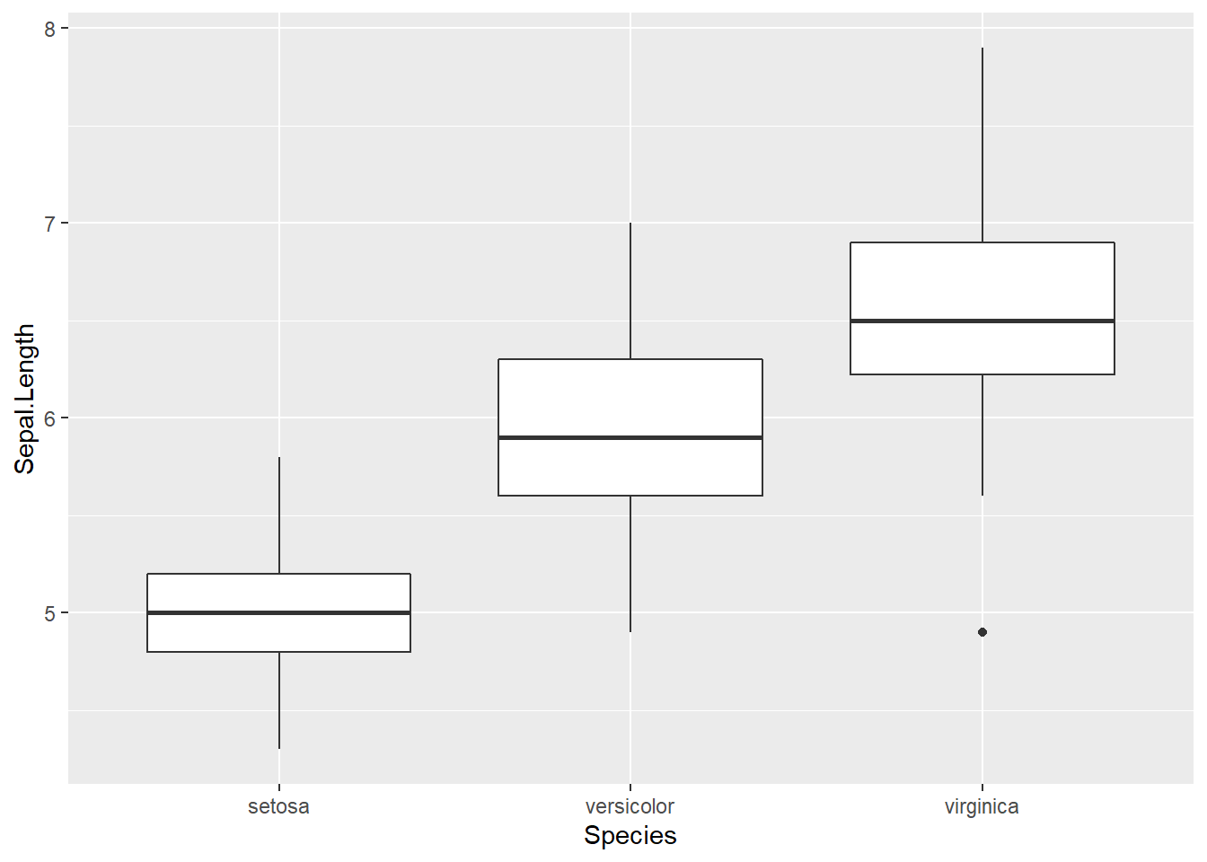
2.2 Com gracinhas
starwars %>%
  drop_na(height) %>%
  ggplot(aes(height))+
  coord_flip()  +  #inverte os eixos x e y
  geom_boxplot(fill = "steelblue")+
  theme_light()+
  labs(title = "Boxplot of Height",x="Height of Characters")+
  theme(plot.title = element_text(hjust = 0.5)) #titulo no centro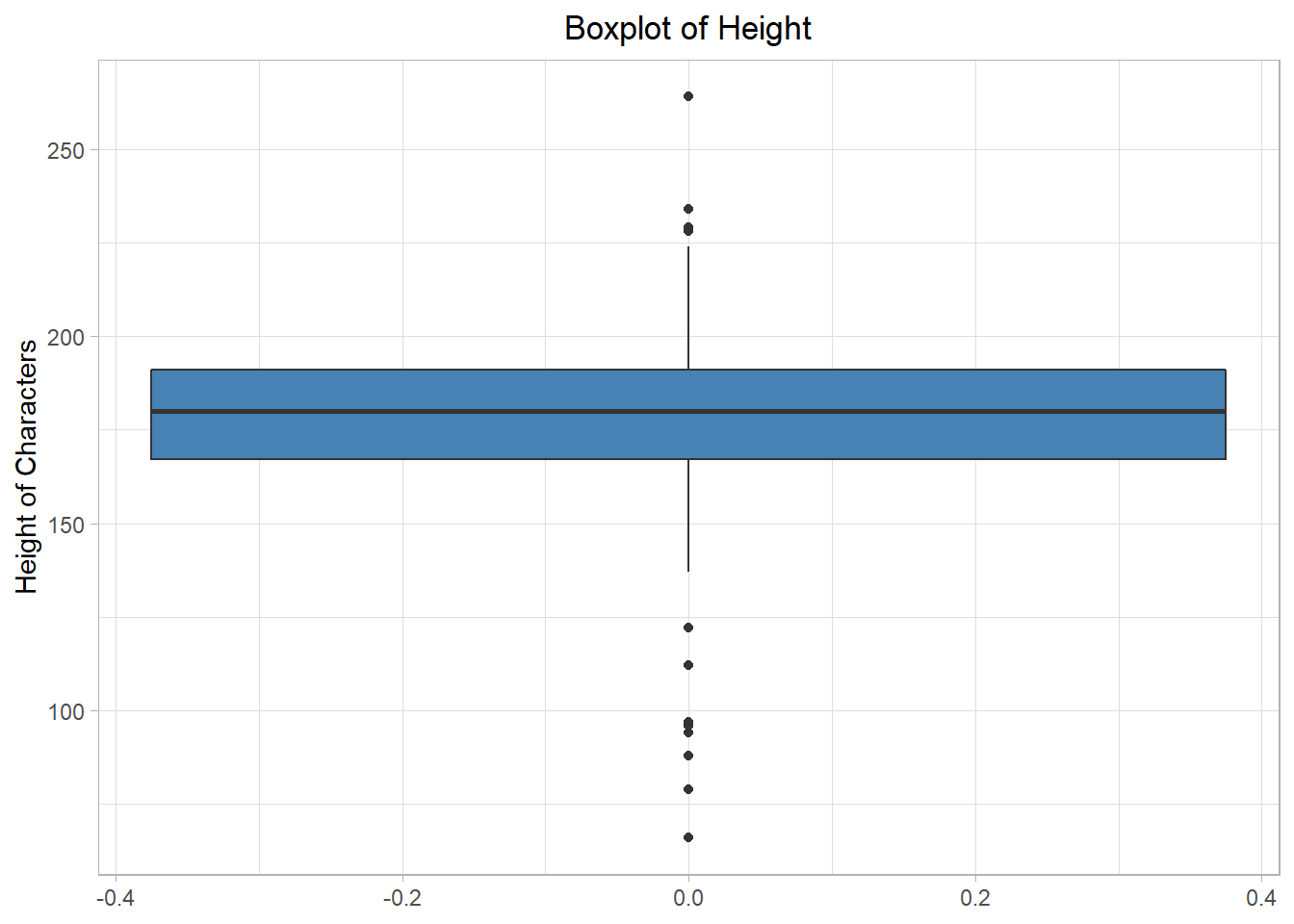
2.3 Com pontos por cima
# Boxplots of mpg by number of gears
# observations (points) are overlayed and jittered
qplot(gear, mpg, data=mtcars, geom=c("boxplot", "jitter"),
   fill=gear, main="Mileage by Gear Number",
   xlab="", ylab="Miles per Gallon")
## Warning: Continuous x aesthetic -- did you forget aes(group=...)?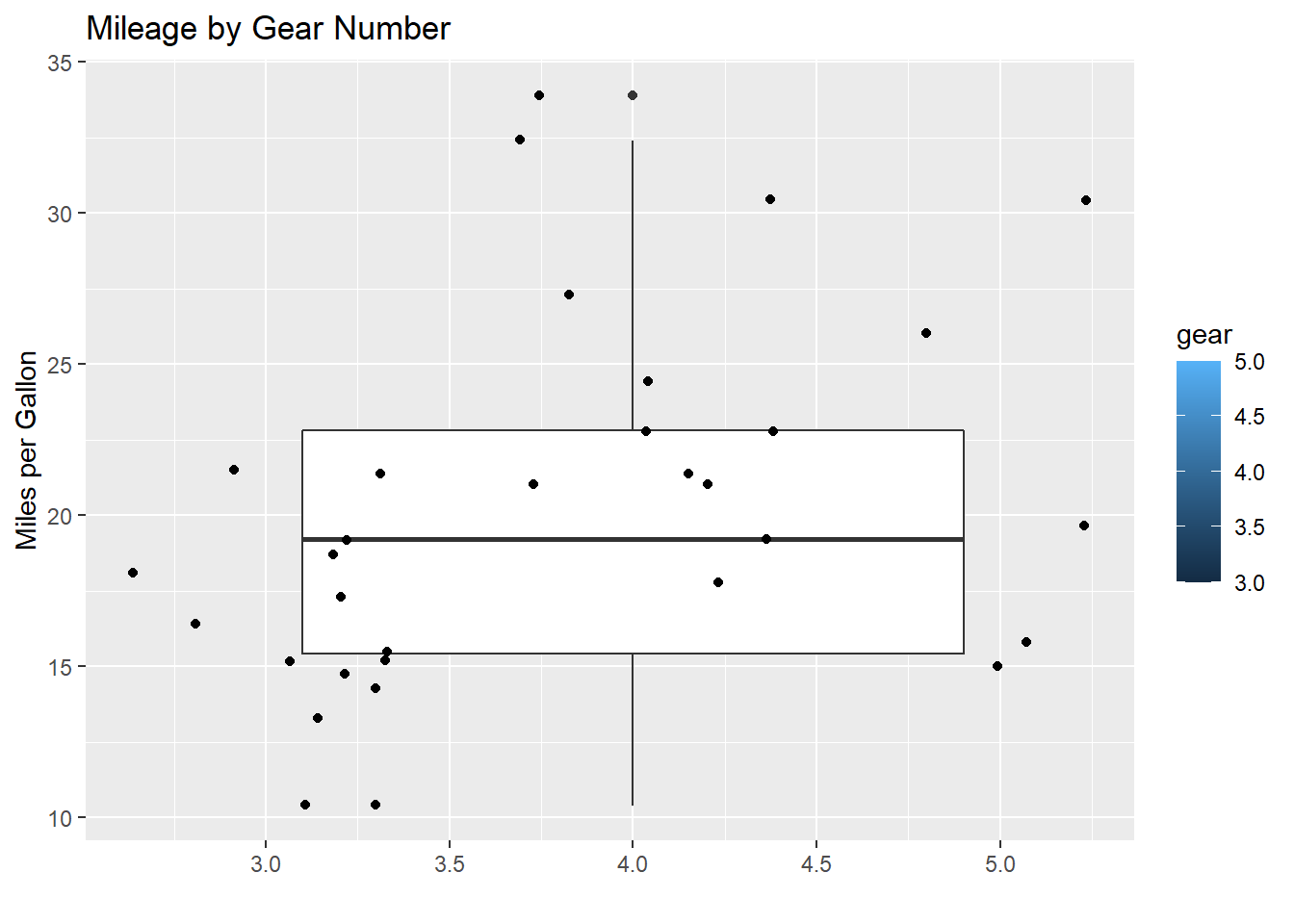
2.4 Violin
ggplot(iris,aes(Species,Sepal.Length)) +
  geom_violin()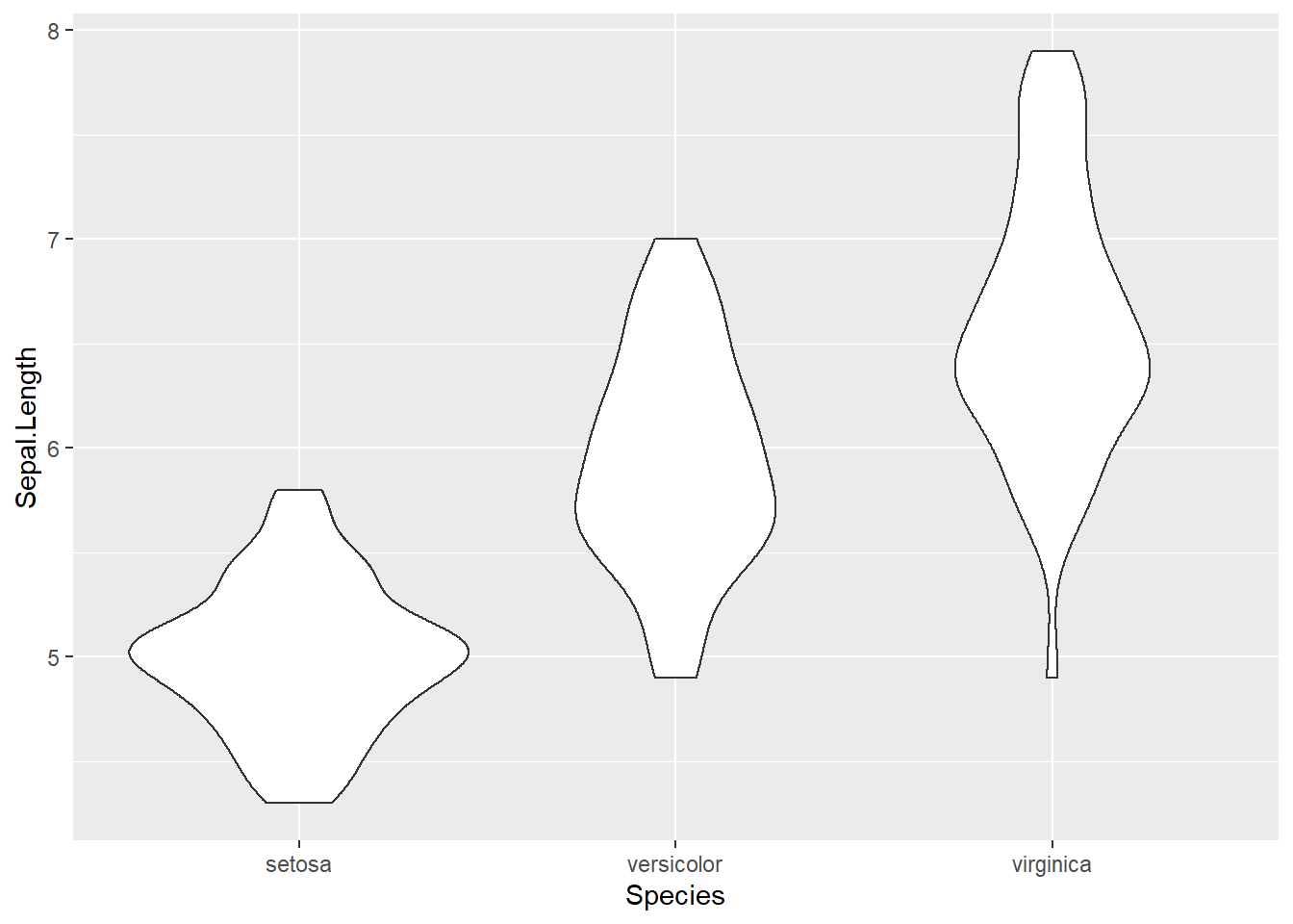
3 Histograma
3.1 Básico
iris %>% ggplot(aes(Sepal.Width))+
  geom_histogram()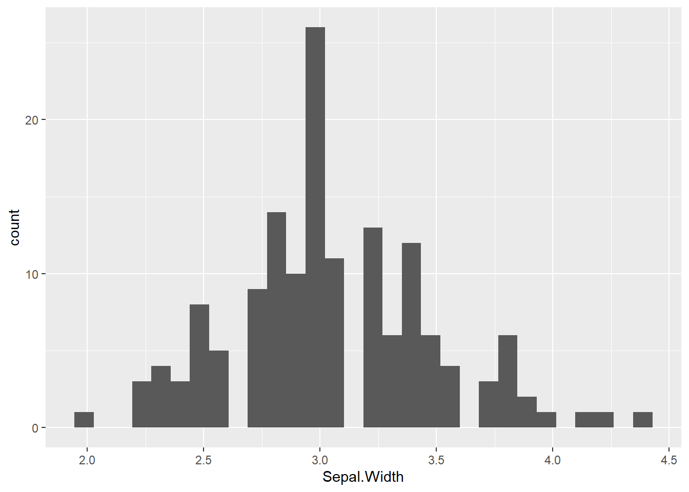
3.2 Com legendas
starwars %>%
  drop_na(height) %>%
  ggplot(aes(height))+
  geom_histogram()+
  labs(title = "Histograms of Height",x="Height of Characters")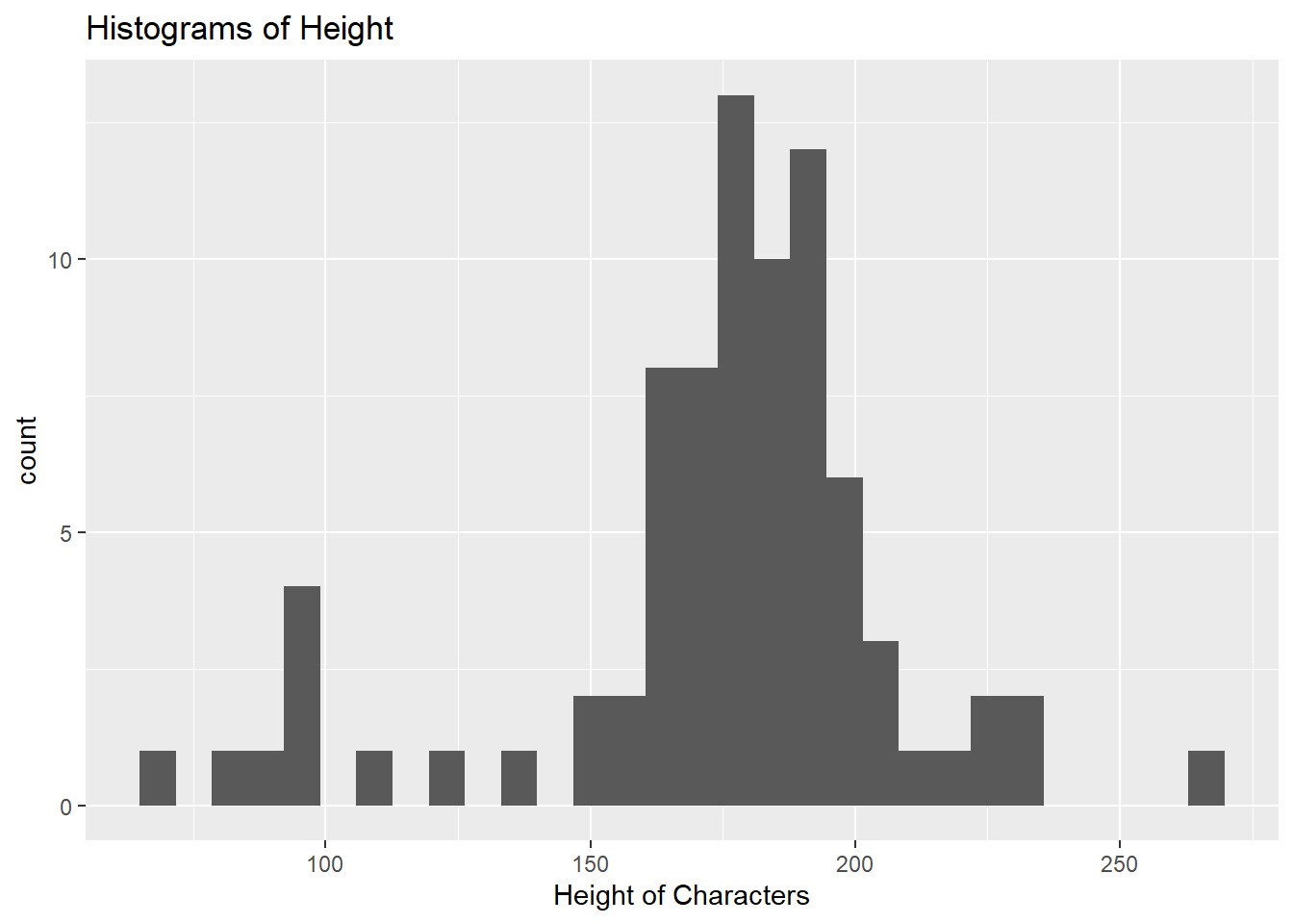
3.3 Set nº bins
iris %>% ggplot(aes(Sepal.Width))+
  geom_histogram(bins = 10, fill="#009999",colour="white")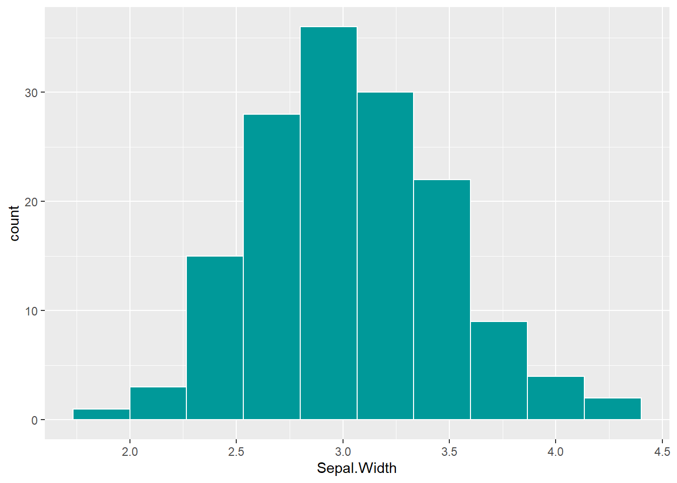
3.4 Criar Distribuição Normal
set.seed(123)
df <- data.frame(x=rnorm(1000))
ggplot(df,aes(x))+
  geom_histogram(bins = 10)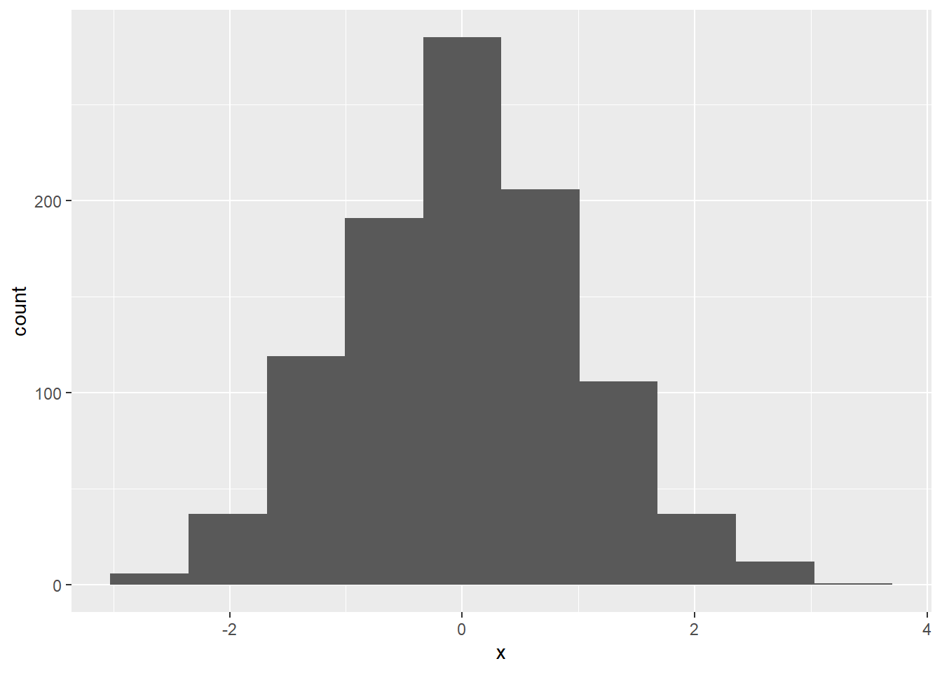
df <- data.frame(x=rgamma(1000,shape = 1/2))
ggplot(df,aes(x))+
  geom_histogram(bins = 10,)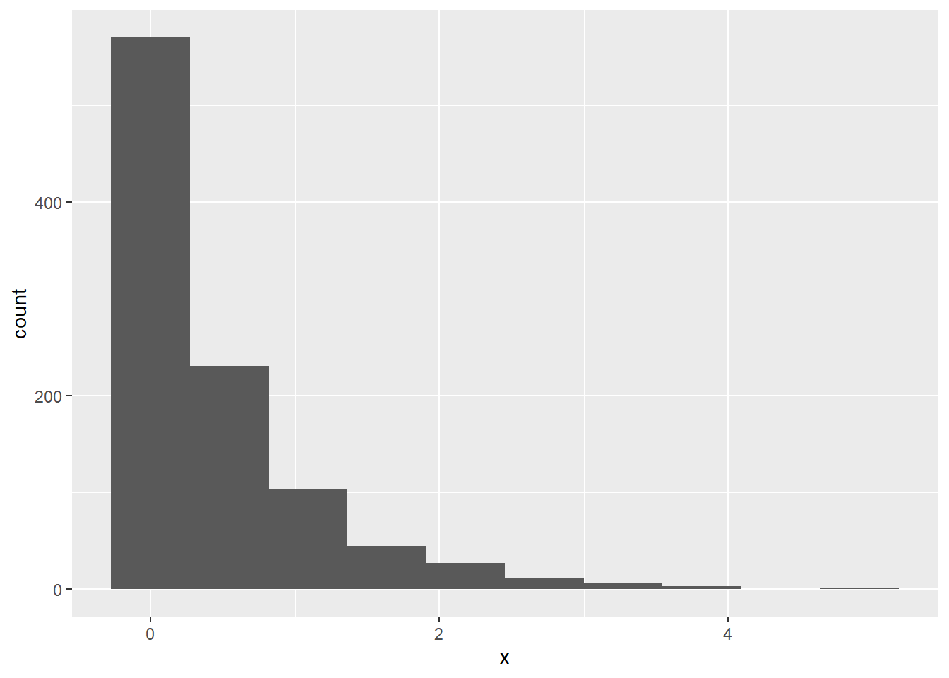
df <- data.frame(x=rbinom(1000, 150,.05))
ggplot(df,aes(x))+
  geom_histogram(bins = 10)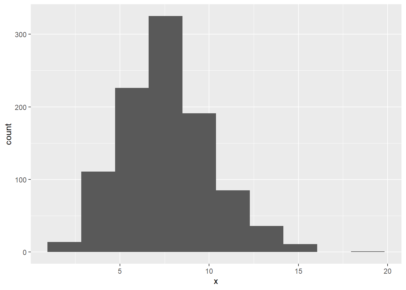
3.5 Com medidas
cars$length <- cars$speed
bw <- diff(range(cars$length)) / (2 * IQR(cars$length) / length(cars$length)^(1/3))

sumstatz <- data.frame(whichstat = c("mean",
                                     "sd upr",
                                     "sd lwr"),
                       value     = c(mean(cars$length),
                                     mean(cars$length)+sd(cars$length),
                                     mean(cars$length)-sd(cars$length)))

ggplot(data=cars, aes(length)) +
  geom_histogram(aes(y =..density..),
                 col="black",
                 binwidth = bw) +
  geom_density(col="black") +
  geom_vline(data=sumstatz,aes(xintercept = value,
                               linetype = whichstat,
                               col = whichstat),size=1)+
  labs(title='Length Plot', x='Length', y='Count')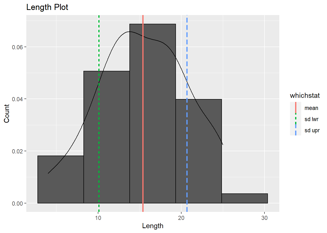
4 Barras
4.1 Select random samples
set.seed(1964)
idx <- sample(1:150, 10) #Pega 10 valores de 150 Ex: [1,4,63,121...] na proxima execução [2,7,21,51]
iris[idx,]
## Sepal.Length Sepal.Width Petal.Length Petal.Width Species
## 31 4.8 3.1 1.6 0.2 setosa
## 44 5.0 3.5 1.6 0.6 setosa
## 144 6.8 3.2 5.9 2.3 virginica
## 63 6.0 2.2 4.0 1.0 versicolor
## 48 4.6 3.2 1.4 0.2 setosa
## 119 7.7 2.6 6.9 2.3 virginica
## 92 6.1 3.0 4.6 1.4 versicolor
## 124 6.3 2.7 4.9 1.8 virginica
## 52 6.4 3.2 4.5 1.5 versicolor
## 47 5.1 3.8 1.6 0.2 setosaggplot(iris[idx,],aes(x=Species))+
geom_bar(fill="#009999",colour="white")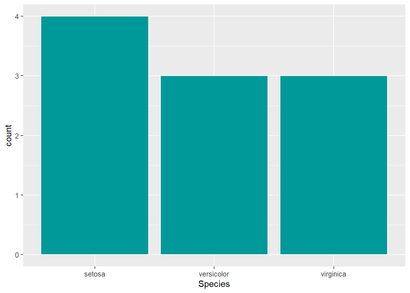
4.2 Basic
data(starwars)
starwars %>% ggplot(aes(x=species)) +
  geom_bar()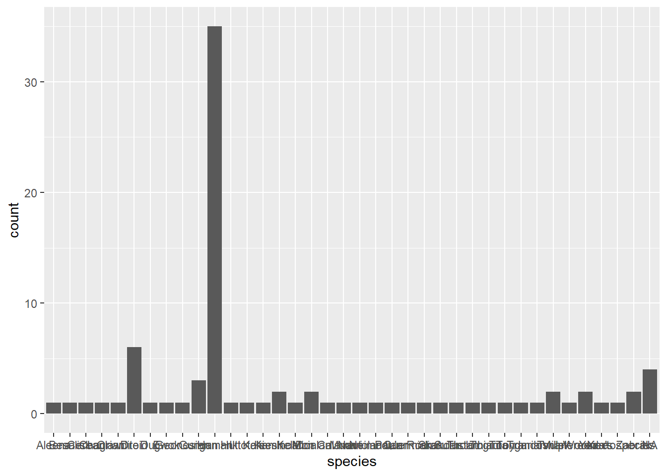
theme(plot.title = element_text(hjust = 0.5)) #titulo no centro## List of 1
## $ plot.title:List of 11
## ..$ family : NULL
## ..$ face : NULL
## ..$ colour : NULL
## ..$ size : NULL
## ..$ hjust : num 0.5
## ..$ vjust : NULL
## ..$ angle : NULL
## ..$ lineheight : NULL
## ..$ margin : NULL
## ..$ debug : NULL
## ..$ inherit.blank: logi FALSE
## ..- attr(*, "class")= chr [1:2] "element_text" "element"
## - attr(*, "class")= chr [1:2] "theme" "gg"
## - attr(*, "complete")= logi FALSE
## - attr(*, "validate")= logi TRUE4.3 Ordered
  # Prepare data: group mean city mileage by manufacturer.
cty_mpg <- aggregate(mpg$cty, by=list(mpg$manufacturer), FUN=mean)  # aggregate
colnames(cty_mpg) <- c("make", "mileage")  # change column names
cty_mpg <- cty_mpg[order(cty_mpg$mileage), ]  # sort
cty_mpg$make <- factor(cty_mpg$make, levels = cty_mpg$make)  # to retain the order in plot.

  # Draw plot
ggplot(cty_mpg, aes(x=make, y=mileage)) +
  geom_bar(stat="identity", width=.5, fill="tomato3") +
  labs(title="Ordered Bar Chart",
       subtitle="Make Vs Avg. Mileage",
       caption="source: mpg") +
  theme(axis.text.x = element_text(angle=65, vjust=0.6))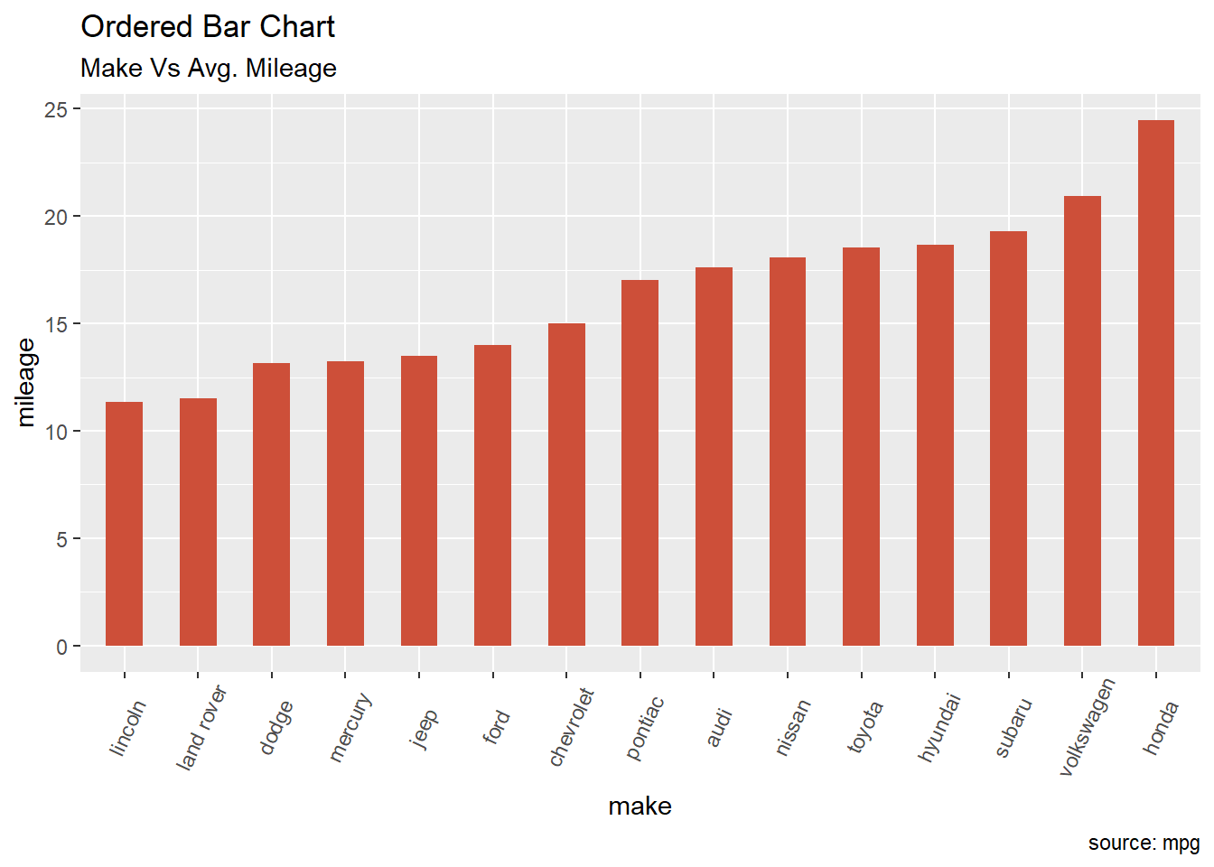
5 Densidade
5.1 Densidade simples
iris %>% ggplot(aes(Sepal.Width))+
  geom_density()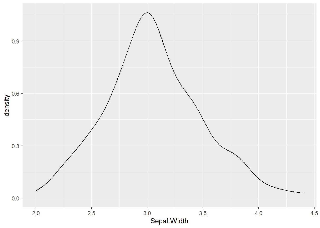
5.2 Com 2 variáveis
#DENSITY PLOTS
data(starwars)
starwars %>%
  drop_na(height) %>%
  filter(sex %in% c("male","female")) %>%
  ggplot(aes(height, color = sex, fill = sex))+ #color = cor da linha #fill cor do preenchimento
  geom_density(size=1,alpha=0.2)+
  theme_light()+
  labs(title = "Desity of Heights",x="Height of Characters")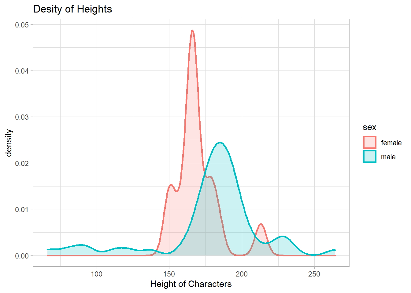
5.3 Com médias
    #ADD MIDDLE LINE
library(gapminder)
europe <- gapminder %>% filter(continent %in% "Europe") %>% select(lifeExp)
mean_life_europe <- mean(europe$lifeExp)
africa <- gapminder %>% filter(continent %in% "Africa") %>% select(lifeExp)
mean_life <- mean(africa$lifeExp)
gapminder %>%
  filter(continent %in% c("Africa","Europe")) %>%
  ggplot(aes(lifeExp, color = continent, fill = continent))+ #color = cor da linha #fill cor do preenchimento
  geom_density(size=1,alpha=0.2)+
  theme_light()+
  labs(title = "Life Expectancy Per Continent",x="Age")+
  theme(plot.title = element_text(hjust = 0.5))+ #titulo no centro

  geom_vline(xintercept=mean_life, size=1.5, color="red")+
  geom_text(aes(x=mean_life, label=paste0("Mean\n",mean_life), y=0.1))+

  geom_vline(xintercept=mean_life_europe, size=1.5, color="blue")+
  geom_text(aes(x=mean_life_europe, label=paste0("Mean\n",mean_life_europe), y=0.1))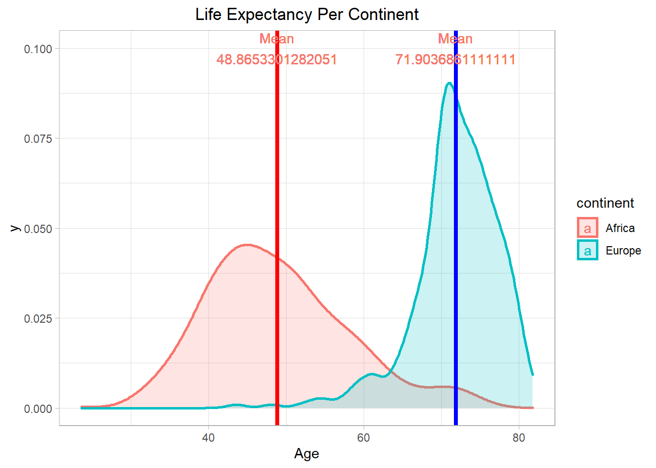
6 Lines
6.1 Lines
ggplot(cars,aes(x=speed,y=dist)) +
  geom_line()+
  geom_point()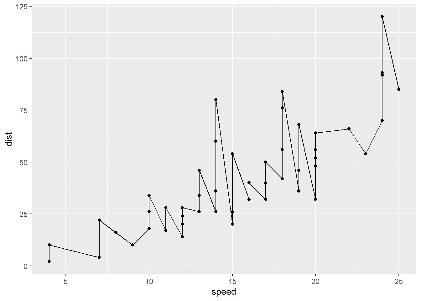
7 Tree Map
  library(treemapify)
  group <- paste("Group", 1:9)
  subgroup <- c("A", "C", "B", "A", "A",
                "C", "C", "B", "B")
  value <- c(7, 25, 50, 5, 16,
             18, 30, 12, 41)

  df <- data.frame(group, subgroup, value)
  ggplot(df, aes(area = value, fill = group,label = paste(group, value, sep = "\n"))) +
    geom_treemap()+
    geom_treemap_text(colour = "white",
                      place = "centre",
                      size = 15) +
    theme(legend.position = "none")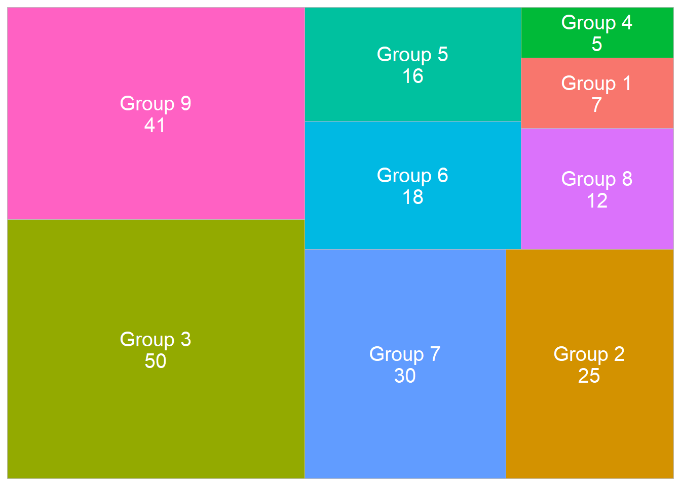
8 3D Graphs
#3D GRAPHS
set.seed(417)
library(plotly)
temp <- rnorm(100, mean=30, sd=5)
pressure <- rnorm(100)
dtime <- 1:100

plot_ly(x=temp, y=pressure, z=dtime, type="scatter3d", mode="markers", color=temp)
9 Hierarchical Dendogram
  # Load data
rm(starwars)
starwars <- starwars %>% drop_na(everything())
row <- starwars$name
starwars <- Filter(is.numeric, starwars)
starwars <- as.data.frame(starwars)
row.names(starwars) <- row
  # Compute distances and hierarchical clustering
dd <- dist(scale(starwars), method = "euclidean")
hc <- hclust(dd, method = "ward.D2")
  # Convert hclust into a dendrogram and plot
hcd <- as.dendrogram(hc)
  # Default plot
plot(hcd, type = "rectangle", ylab = "Ordem de relação",main="Dendograma de relação física e de idade dos personagens")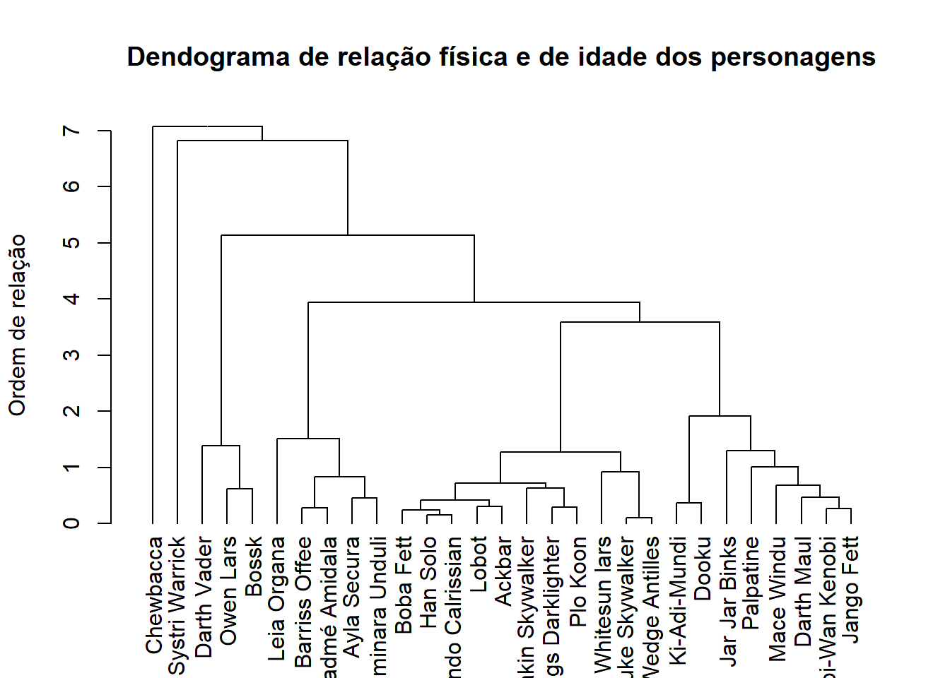
10 Pie Chart
  #Convert table of observations to dataframe
  data(starwars)
  table <- table(starwars$species)
  df <- t(rbind(table))
  df <- as.data.frame(df)
  df$species <- row.names(df)

  bp<- ggplot(df, aes(x="", y=table, fill=species))+
    geom_bar(width = 1, stat = "identity")
  pie <- bp + coord_polar("y", start=0)
  pie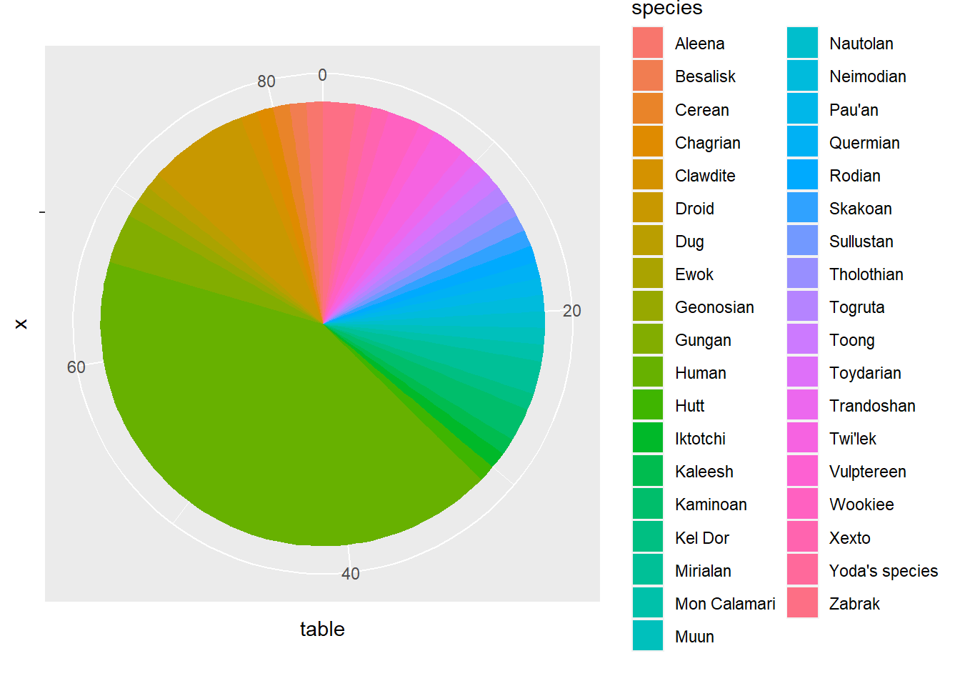
11 Piramid Comparation
email_campaign_funnel <- read.csv("https://raw.githubusercontent.com/selva86/datasets/master/email_campaign_funnel.csv")
  # X Axis Breaks and Labels
brks <- seq(-15000000, 15000000, 5000000)
lbls = paste0(as.character(c(seq(15, 0, -5), seq(5, 15, 5))), "m")

  # Plot
library(ggthemes)
options(scipen = 999)  # turns of scientific notations like 1e+40
a <- ggplot(email_campaign_funnel, aes(x = Stage, y = Users, fill = Gender)) +   # Fill column
  geom_bar(stat = "identity", width = .6) +   # draw the bars
  scale_y_continuous(breaks = brks,   # Breaks
                     labels = lbls) + # Labels
  coord_flip() +  # Flip axes
  labs(title="Email Campaign Funnel") +
  theme_tufte() +  # Tufte theme from ggfortify
  theme(plot.title = element_text(hjust = .5),
        axis.ticks = element_blank()) +   # Centre plot title
  scale_fill_brewer(palette = "Dark2")  # Color palette
  #PLOT INTERATIVO
  library(plotly)
  ggplotly(a)
12 Bubble Chart -> 2 numerical variables and categorical variable
starwars %>%
  filter(mass<200) %>%
  ggplot(aes(height,mass))+
  geom_jitter(aes(col = sex, size = birth_year))+
  geom_smooth(aes(col=sex),method="lm",se=F)
## `geom_smooth()` using formula 'y ~ x'## Warning: Removed 23 rows containing missing values (geom_point).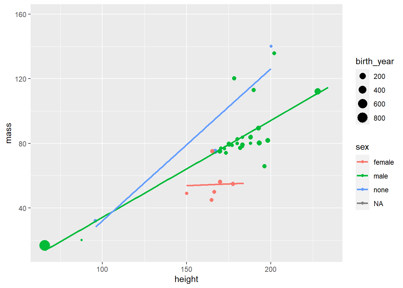
13 Ridge Plot
14 PLOT OPTIONS
df <- data.frame(speed = 10, dist = 160)


#PATCHWORK Plot multiple graphs
library(patchwork)
data(starwars)
p1 <- ggplot(starwars,aes(x=species,fill=height)) +
  geom_bar()

p2 <- ggplot(starwars,aes(x=species)) +
  geom_bar(color = "red",fill= "white")

p1/p2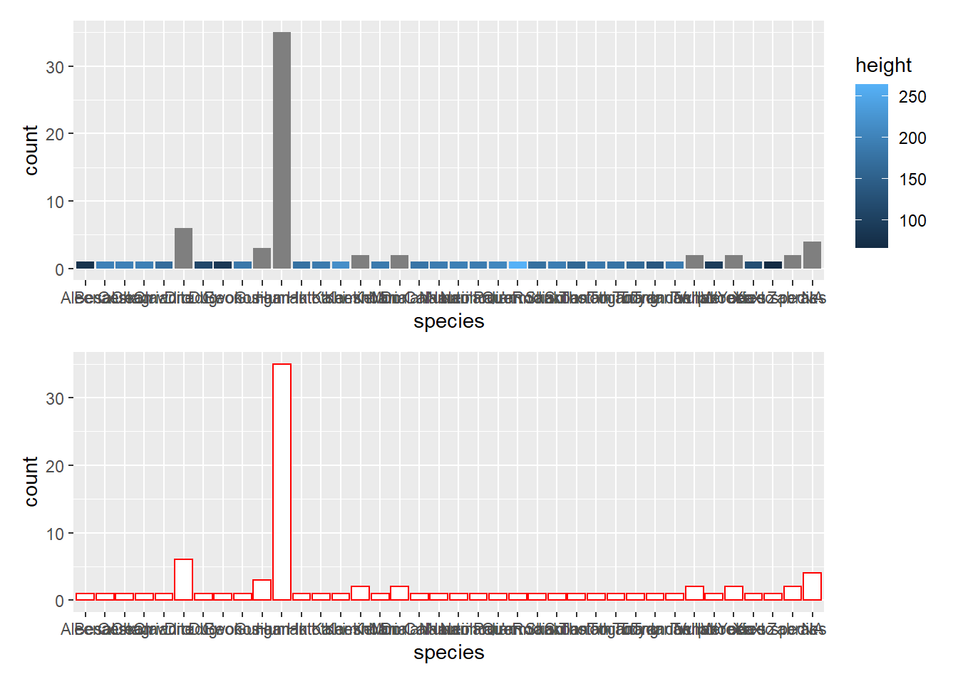
(p1 | p2) / p2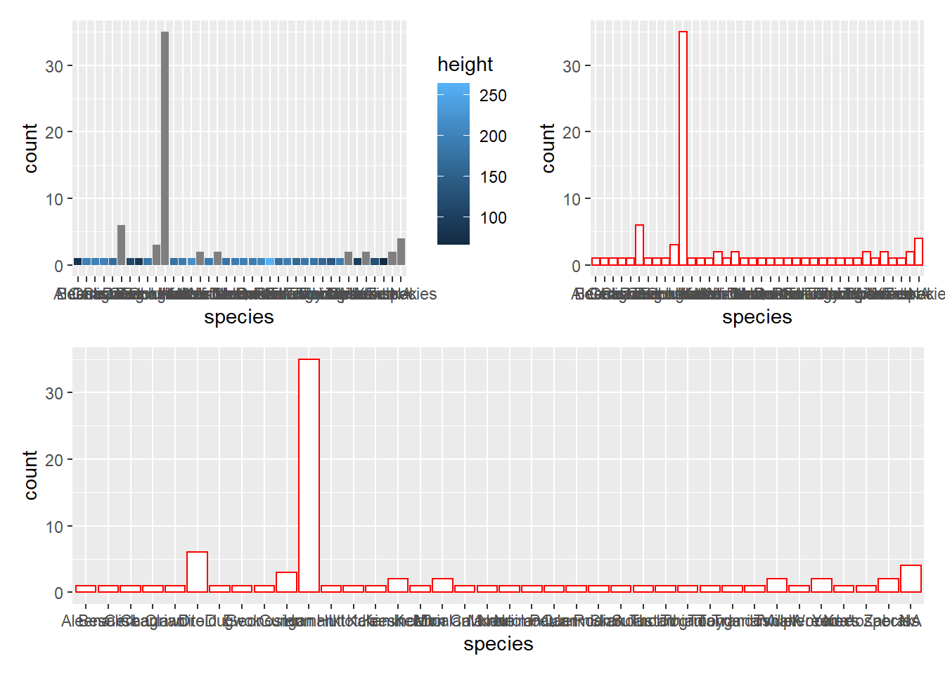
p1 | (p1/p1)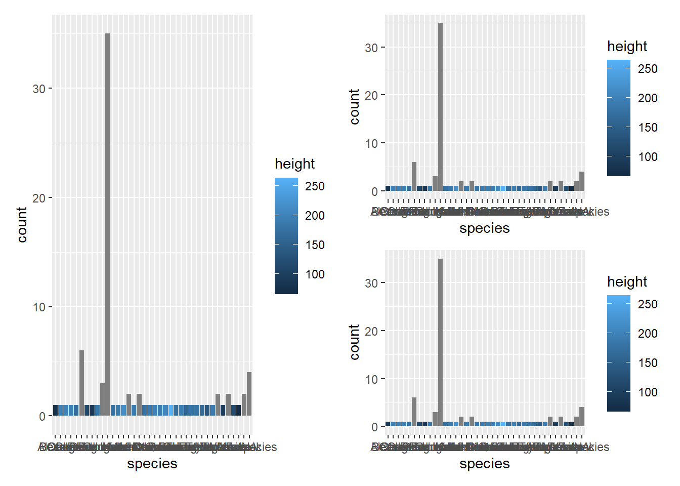
#ADD Y LIMITS
starwars %>%
  ggplot(aes(height,mass)) +
  geom_point()+
  scale_y_continuous(limits = c(20, 200))+
  coord_flip()  #inverte os eixos x e y
## Warning: Removed 31 rows containing missing values (geom_point).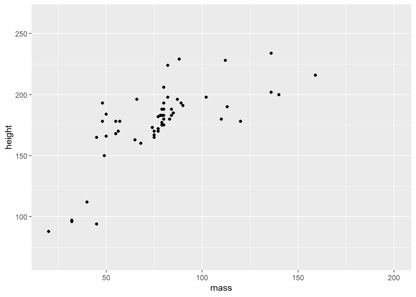
#FACET WRAP -PLOT GRAPHS FOR MULTIPLE VARIABLES: EX: MALE/FEMALE
starwars %>%
  drop_na(everything()) %>%
  filter(mass <200) %>%
  ggplot(aes(height,mass)) +
  geom_point(aes(colour = hair_color, size = hair_color),alpha = 0.4) +
  facet_wrap(~sex) +
  labs(x = 'Height',
       y= "Mass",
       title = "Star Wars Plot")+
  theme_minimal()
## Warning: Using size for a discrete variable is not advised.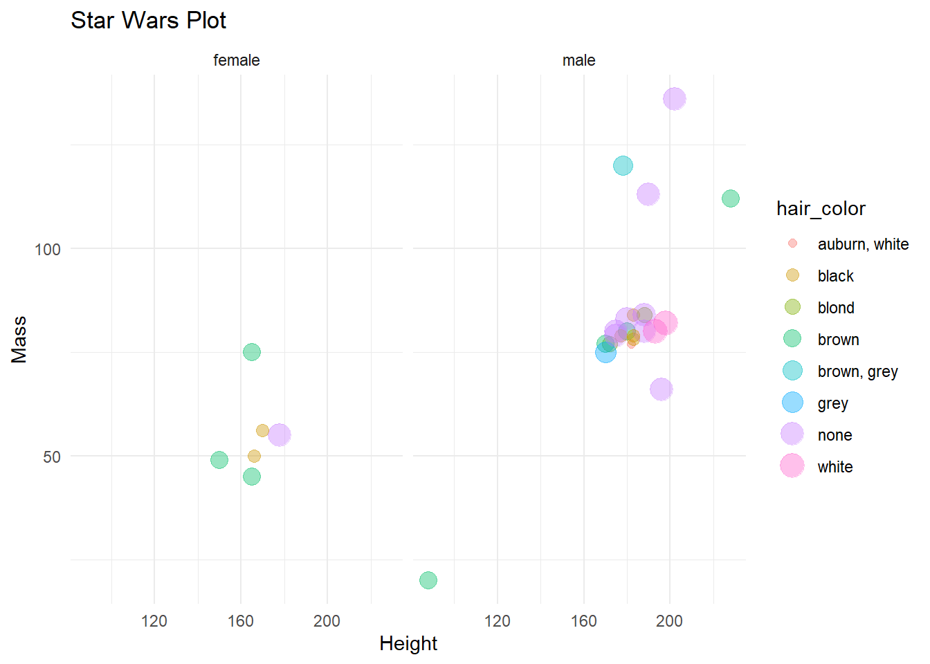
#PLOT ALL VARIABLE COLUMNS BY ALL NUMERIC COLUMNS
#AND FILTER BASED ON COLORS
starwars$sex <- as.factor(starwars$sex)
starwars <- starwars %>%
  mutate(sex = factor(sex,levels = c("male","female","hermaphroditic","none")))
levels(starwars$sex)
## [1] "male" "female" "hermaphroditic" "none"factors <- factor(starwars$sex)
colors <- c('blue', 'red','purple','black')[unclass(factors)]
pairs(Filter(is.numeric, starwars),col=colors)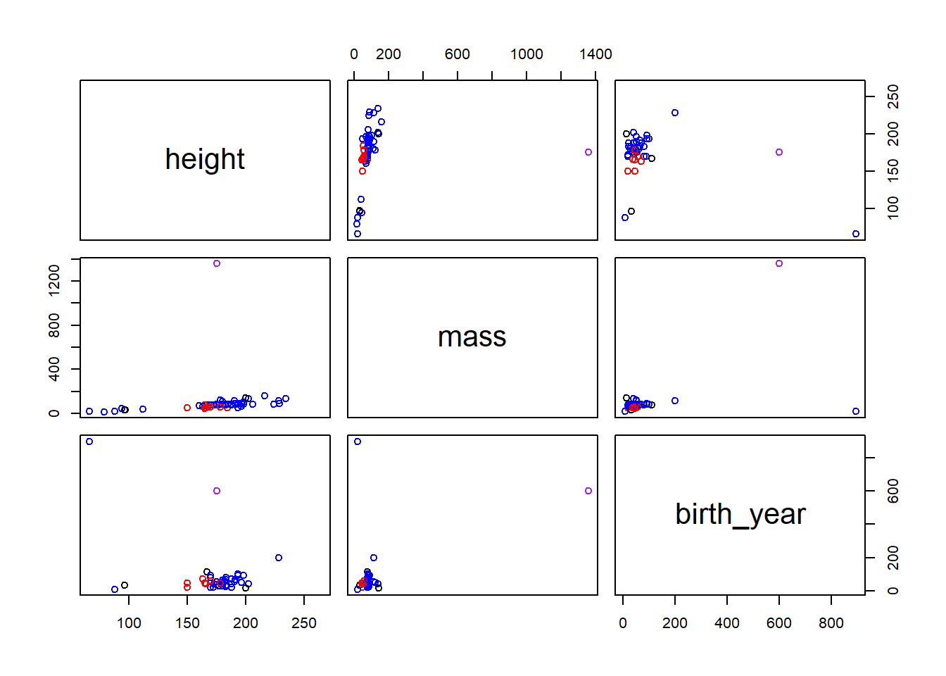
#PLOT MORE THAN 1 LINE
df <- starwars
df %>%
  gather(variables,value,mass,birth_year) %>%
  ggplot(aes(height,value,colour=variables)) +
  geom_point()
## Warning: Removed 72 rows containing missing values (geom_point).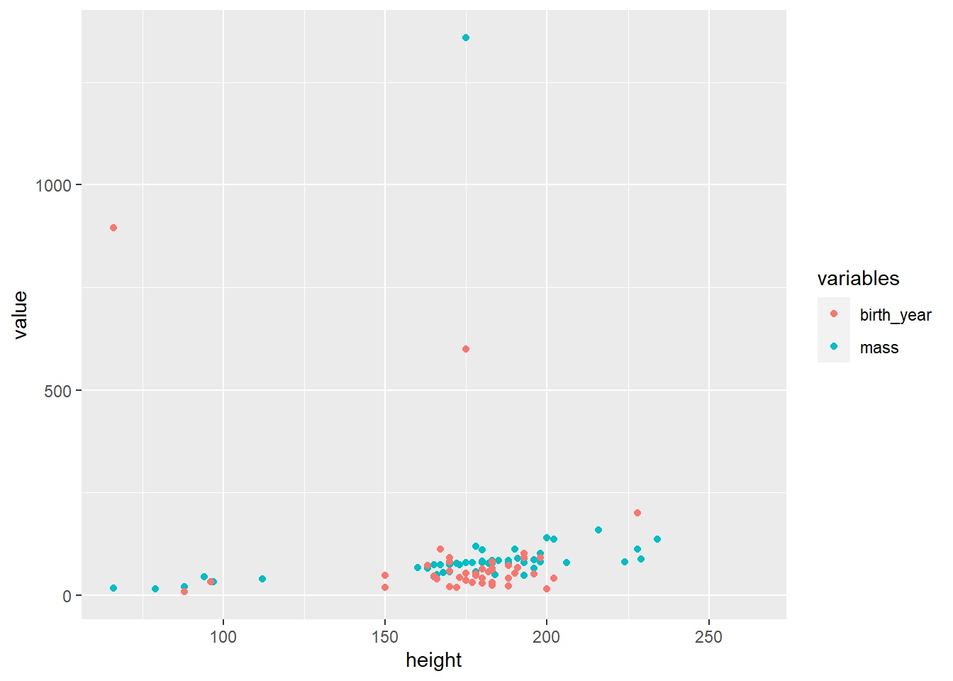
#INTERATIVE PLOT
a <- ggplot(starwars,aes(x=gender)) +
  geom_bar()
library(plotly)
ggplotly(a)